-
Echo Knowledge Base
-
Add-ons
-
Access Manager
Article Page Width
4.7 out Of 5 Stars
3 ratings
| 5 Stars | 33% | |
| 4 Stars | 67% | |
| 3 Stars | 0% | |
| 2 Stars | 0% | |
| 1 Stars | 0% |
Overview
There are three main settings for the article page widths: the search width, the content width, and the sidebar width. This article has been updated since KB version 12.11.0. If you see alternative settings, please update to the latest version.
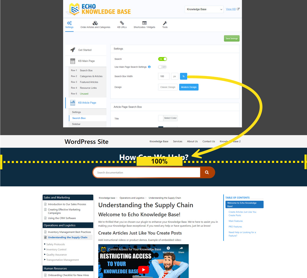
a) Search Box Width
To update the search width, follow these steps:
- Navigate to the backend KB configurations.
- Click on the "Settings" tab.
- Go to the "KB Article Page" section.
- Find the "Search Box" section.
- Update the width value, specifying whether it's in pixels (px) or percentage (%).
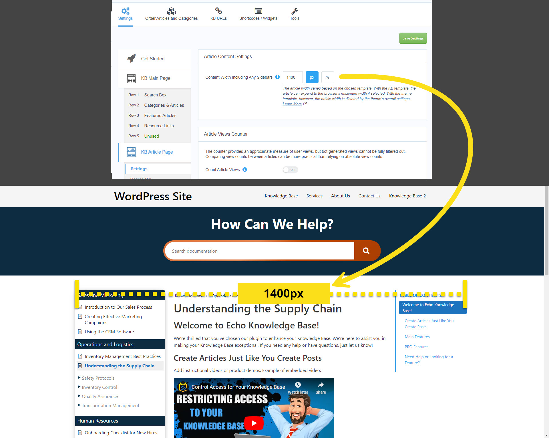
b) Article Page Width
The width of the Article Page cannot exceed the width of the Search Box. If you need the Article Page to be wider than the current Search Box width, adjust the width of the Search Box as described in section a) above.
To update the content width, follow these steps:
- Navigate to the backend KB configurations.
- Click on the "Settings" tab.
- Go to the "KB Article Page" section.
- Find the "Settings" section.
- Update the width value, specifying whether it's in pixels (px) or percentage (%).
Article Width: Current Theme vs. KB Template
The article width varies based on the chosen template. With the KB template, the article can expand to the browser’s maximum width if selected. With the theme template, however, the article width is dictated by the theme’s overall settings.
If the article width seems restricted with the theme template, this may result from the theme’s settings or hardcoded limitations that constrain the overall width. Note that modifying the KB width cannot override the theme’s container settings.
To learn more, click here.
Troubleshooting
If the widths are not expanding beyond your desired preference, it’s most likely related to the theme’s width limits. If the theme does not allow for anything wider, then our the KB article will not surpass that limit. Therefore, make adjustments to your theme to increase the overall website width, and the KB article should expand. If you need help, please contact us.
This article's heading and steps and notices are built with our Creative Addons plugin.
4.7 out Of 5 Stars
3 ratings
| 5 Stars | 33% | |
| 4 Stars | 67% | |
| 3 Stars | 0% | |
| 2 Stars | 0% | |
| 1 Stars | 0% |